The angle of ambition.
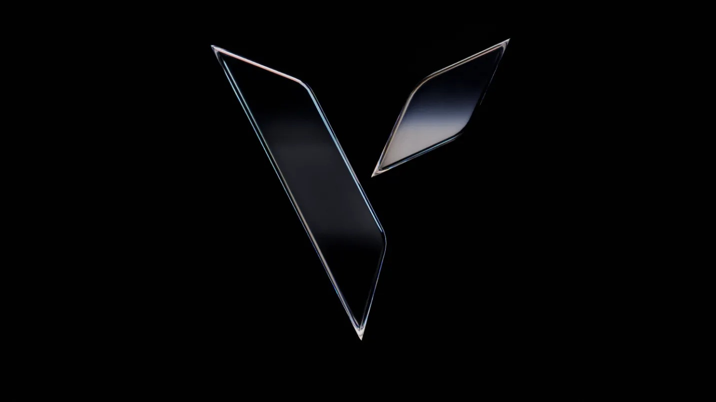
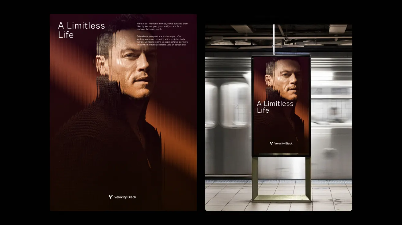
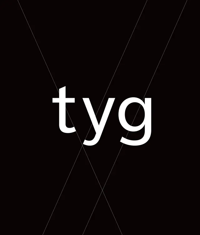
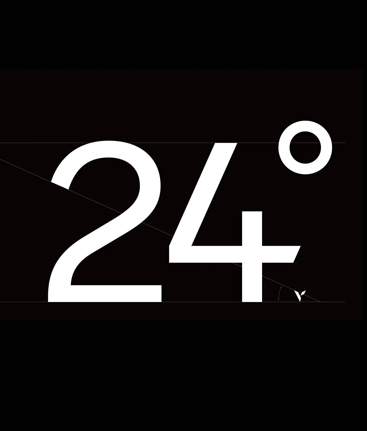
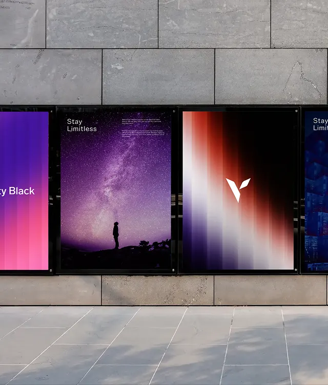
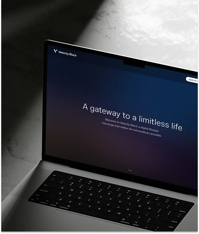
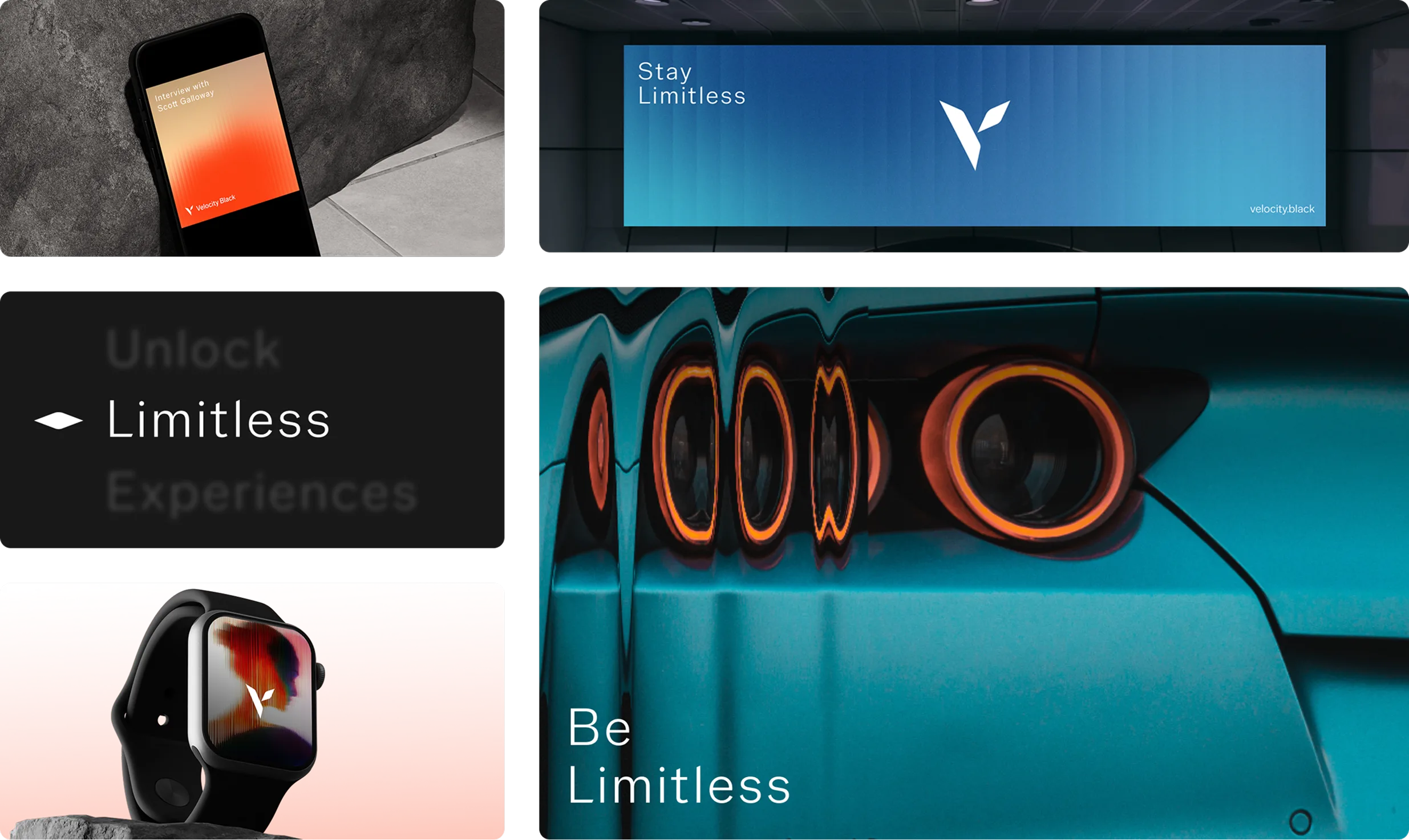
A precise 24-degree angle, drawn from the 24 hours in a day that Velocity Black operates, defines its visual identity. Symbolising ascension and ambition, this upward line is integrated into the bespoke grotesque typeface, Twenty Four Sans, giving every communication a sharp and modern character. The angle shapes the wordmark, icon and type system, acting as a consistent signal of momentum and intent. This visual confidence is mirrored in the brand’s voice: clear and assured, it ensures that from an in-app message to a billboard headline, Velocity Black speaks with a single, unmistakable tone.