Show me all Nike projects
Home

MiroThe future begins in Miro

Insight

We need to innovate the way we innovate.

Our way of working has changed, and so should our workspace. How do we go from just talking to collaborating, when deadlines get shorter and distances longer? When great ideas risk getting lost in bad connections?


Idea

Enter with a dream. Exit with the next big thing.

In the spirit of collaboration, AKQA and Miro embarked on a journey of curious exploration. What does a space of seamless ideation look like? 

The answer lies within the new visual identity: a design that celebrates the power and optimism of true innovation. A portal through which the imaginable becomes reality, the intangible becomes tangible, and the abstract becomes concrete.

Where you don’t just talk together, but work together. Synthesise information, develop strategy, and design and build the future. A place where a shared dream becomes a workstream that turns into the next big thing.
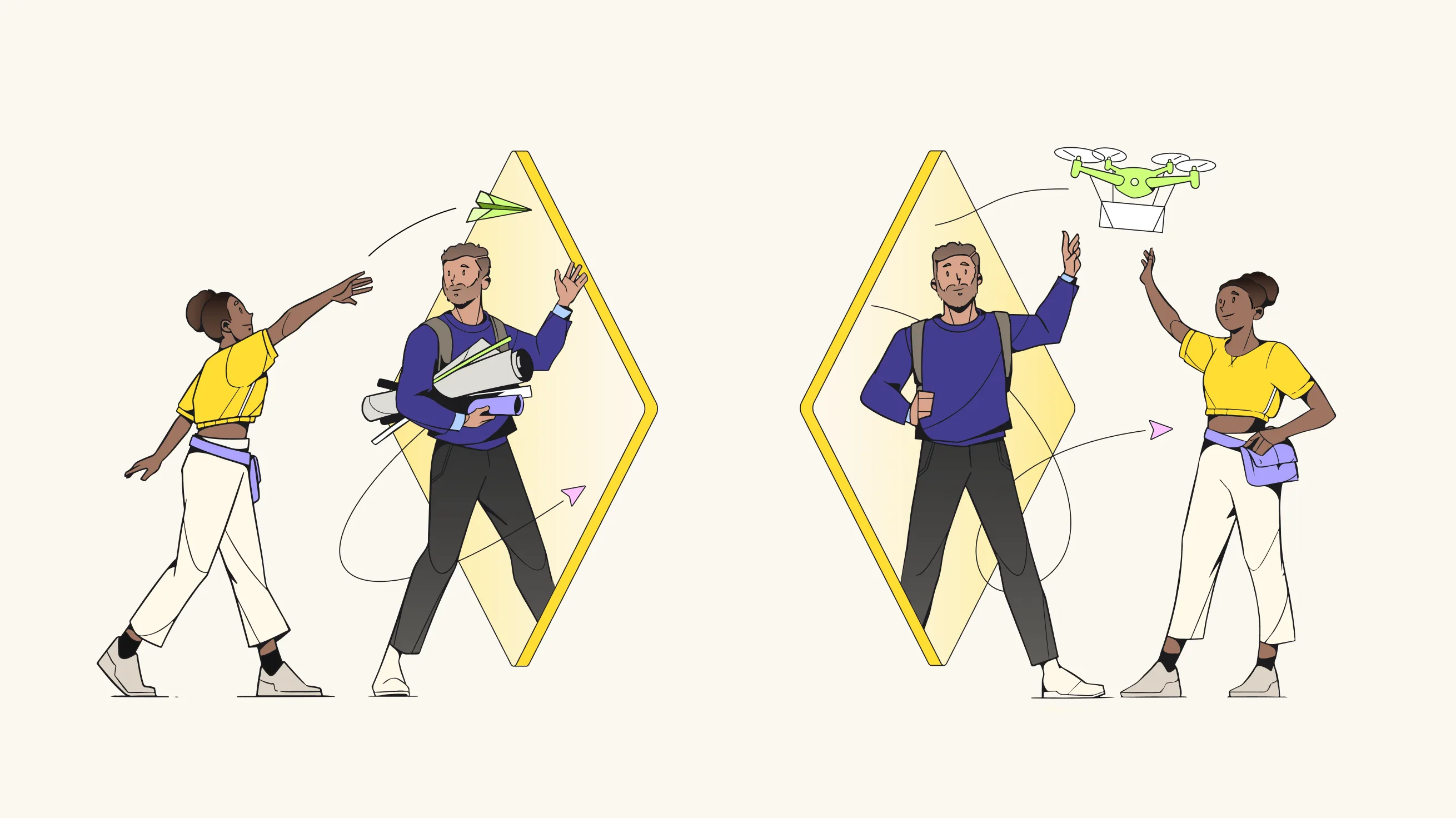
Two people stand on opposite sides of a yellow portal; a woman throws a paper airplane through, while a man catches it and sends a drone back. Both appear to be students, holding books and backpacks.

Visual Identity

A portal to the future.

To symbolise transformation and exploration, the M and other product shapes have become visual portals into the future. This new brand element allows Miro to communicate its ambition – helping teams bring ideas from their notebooks to the history books.


The Miro logo

The logo has been evolved by highlighting the Miro centrepiece: the M symbol. Refinements include simplifying the letters in the wordmark and allowing more breathing room in the yellow square, which brings focus to the M. By softening the edges of the square, the approachable and human side of Miro comes to life. The meticulous logo transformation balances an elevation of the brand and product, while remaining familiar to over 60 million users.


Colour palette

To elevate the feeling of optimism and energy, the yellow hero colour is complemented with a diverse set of secondary colours, offering harmonious combinations that feel vibrant and bright. This colour system also ensures that Miro has flexibility in tonal range to support its product needs.


Typography

As Miro has evolved from an innovative start-up into a leading,
enterprise-ready platform, so has the choice of typography. Embracing Miro’s strategic shift, this mature yet approachable typeface signals that Miro is the go-to workspace for professionals intent on elevating team collaboration and driving innovation. A bespoke version of the typeface Roobert Pro covers over 120 languages, with Thai, Arabic, Korean and Japanese covered by a secondary font.


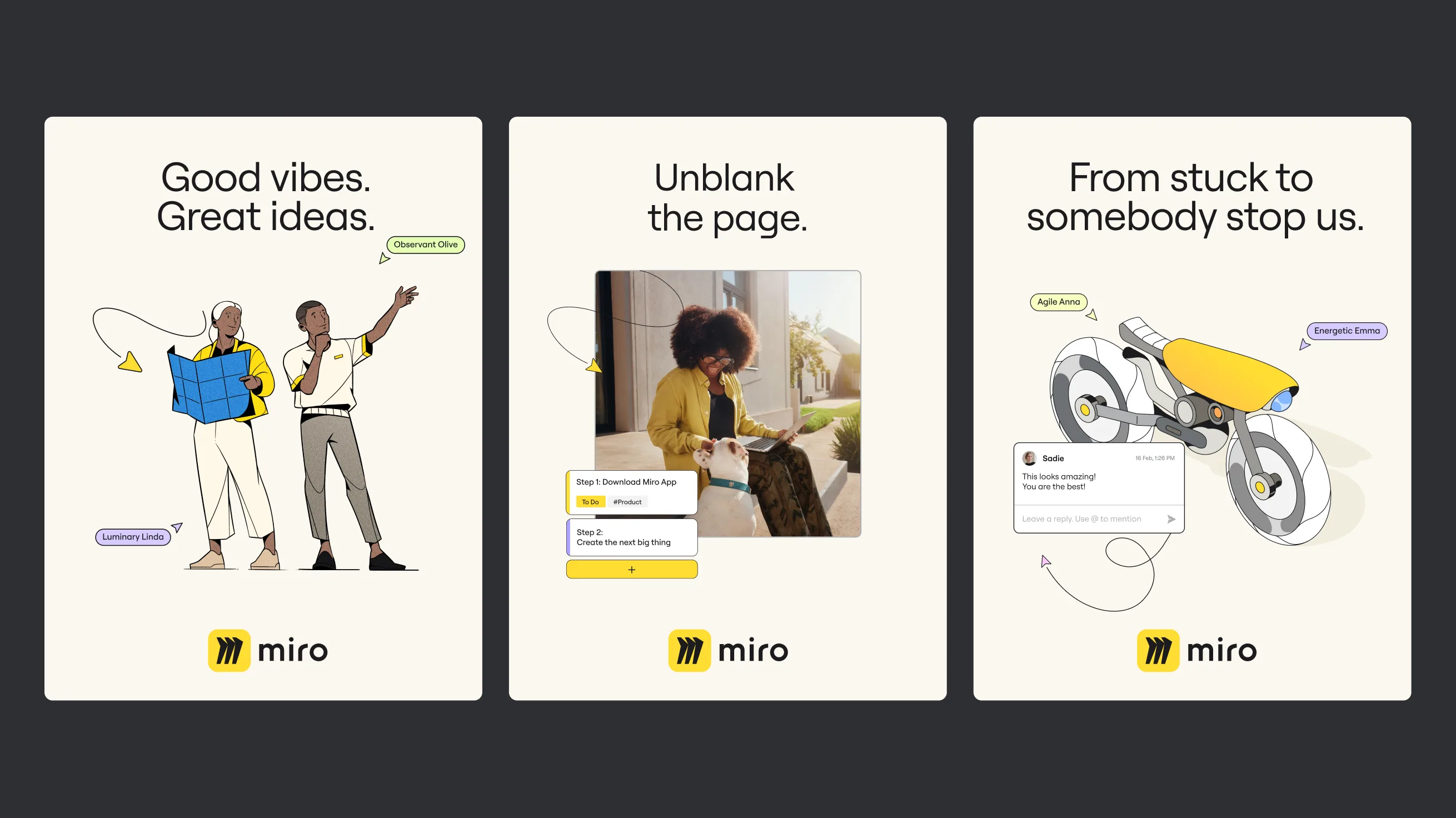
Three illustrated Miro ads: two people celebrating, a woman working on a laptop, and a futuristic bike sketch. Text reads: Good vibes. Great ideas., Unblank the page., and From stuck to somebody stop us.


Illustration

From the ambition of robots replanting the Amazon to the advent of seamless, remote collaborations and autonomous transportation solutions, the illustration style takes cues from current-day marvels and near-future advancements that have the potential to better the fabric of society.


UI implementation

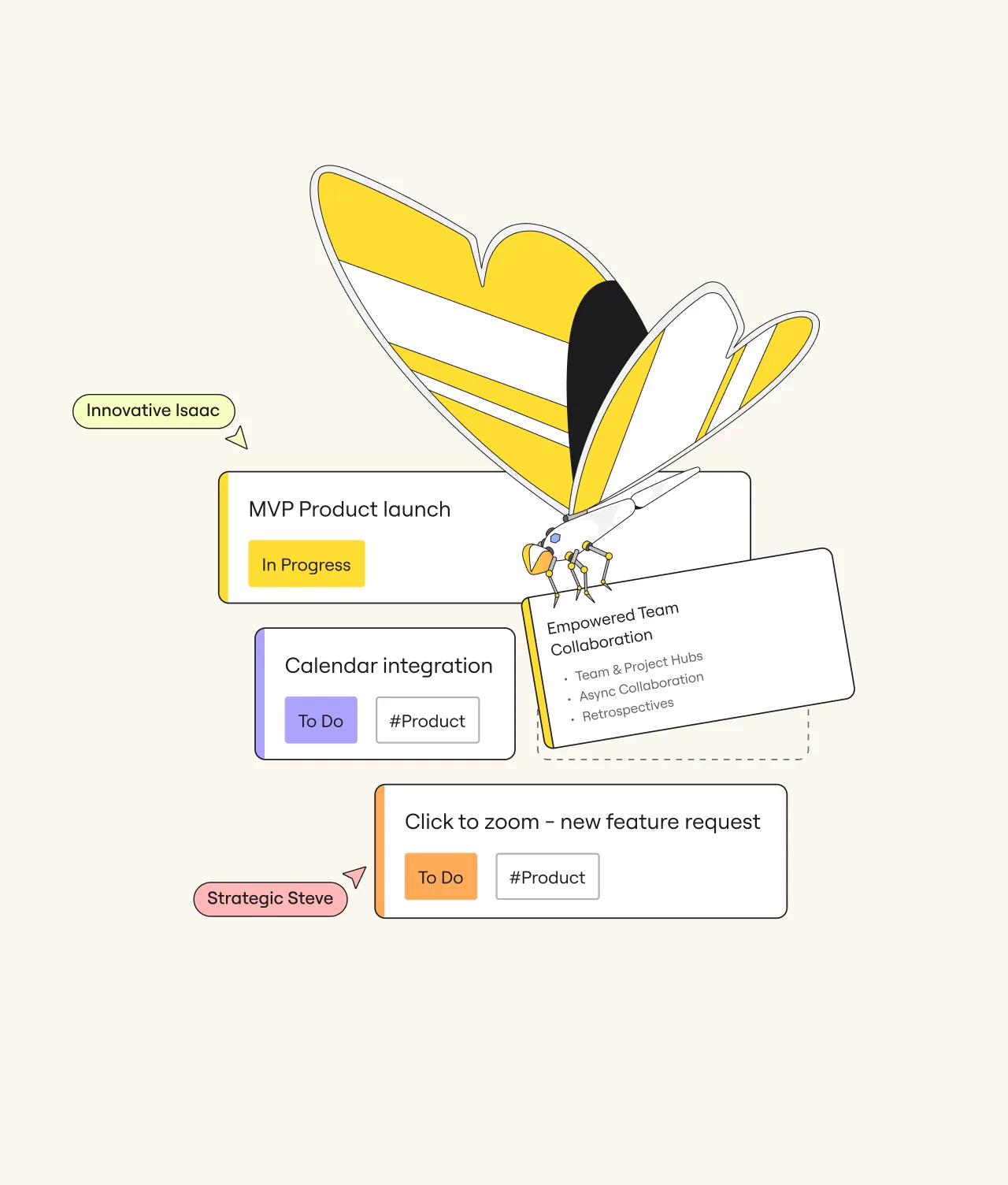
Miro’s most recognisable UI elements are instrumental to the in-product experience, so in the visual identity, these feature in the external branding elements as well. This brings the power of the platform to life across all touchpoints.


A stylized yellow and white butterfly with black accents hovers over labeled task cards, including MVP Product launch, Calendar integration, Empowered Team Collaboration, and Click to zoom – new feature request.


Impact

A fresh experience for over 60 million collaborators.

Complete with a new strategy, visual identity, tone of voice and narrative, the re-energised Miro is a workspace where all – engineers, developers, creatives, project managers and beyond – go to create tomorrow, today, together. Which means the next big thing is just one team away.

miro.com/blog ↘

  • It’s Nice ThatMiro pays tribute to feats of design innovation with AKQA rebrand ↘

RelatedWork

Radio Television Luxembourg

United

rtl case study card v3

Nike

CURV Studios

Curv-card

MARV

Visual Identity

MARV Cover

Webex

The look of collaboration

webex-thumb-hero

What’s yournext frontier?

Footer Fallback Image Gradient
  • Privacy Policy
  • Cookie Policy
  • Perspectives
  • AKQA Companies
  • Sustainability
  • News