Show me all Nike projects
Home

AlibabaMiravia

Insight

One brand does not always fit all.

Alibaba is the world’s sixth-most highly valued brand and a household name on many continents, but not yet in Europe. For the retailer to expand its share in key European markets, a new identity is required: one that cuts through the competition and is firmly rooted in diverse continental needs and desires.


Idea

In both life and e-commerce, to exist is to adapt.

Life on earth is teeming with adaptations. Chameleons famously morph between a range of brilliant hues to stand out in dense jungles, while octopuses alter the texture of their skin to communicate their mood. There are birds whose plumage shifts with the seasons, and even plants that change colour to thrive in different soils. Adaptations are what allow individuals, species and even products and services to stand out when desired, compete when required and thrive, survive and change when necessary.

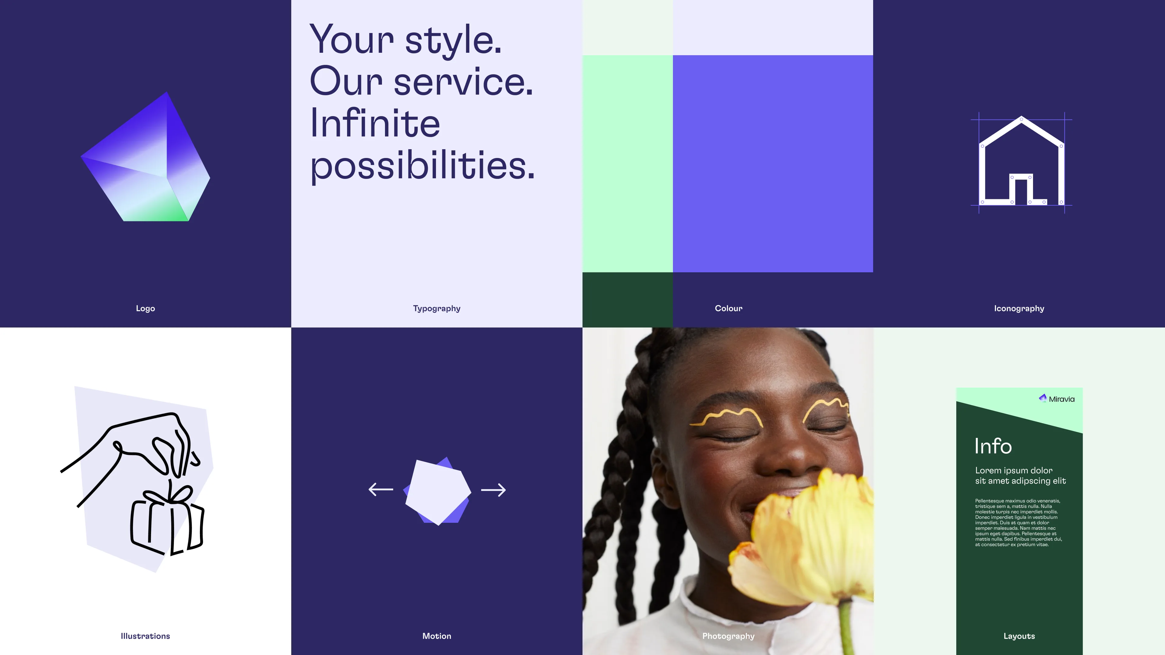
Every element of the identity and design system allows Miravia to adapt and shape-shift to reflect the diverse needs of its wide-ranging audience. Defined in over 160 pages of extensive guidelines, these elements give Miravia a distinctly recognisable but flexible identity.


A grid of eight sections displays colorful branding elements: abstract shapes, typography, color blocks, a house icon, a drawing of hands giving a gift, arrow icons, a woman holding a yellow flower, and an info card.

Impact

Catering to infinite possibilities, Miravia is making its mark in Europe.

The brand identity and guidelines mirror Miravia’s ambition to fit for every occasion, story and person.

Miravia.com ↘

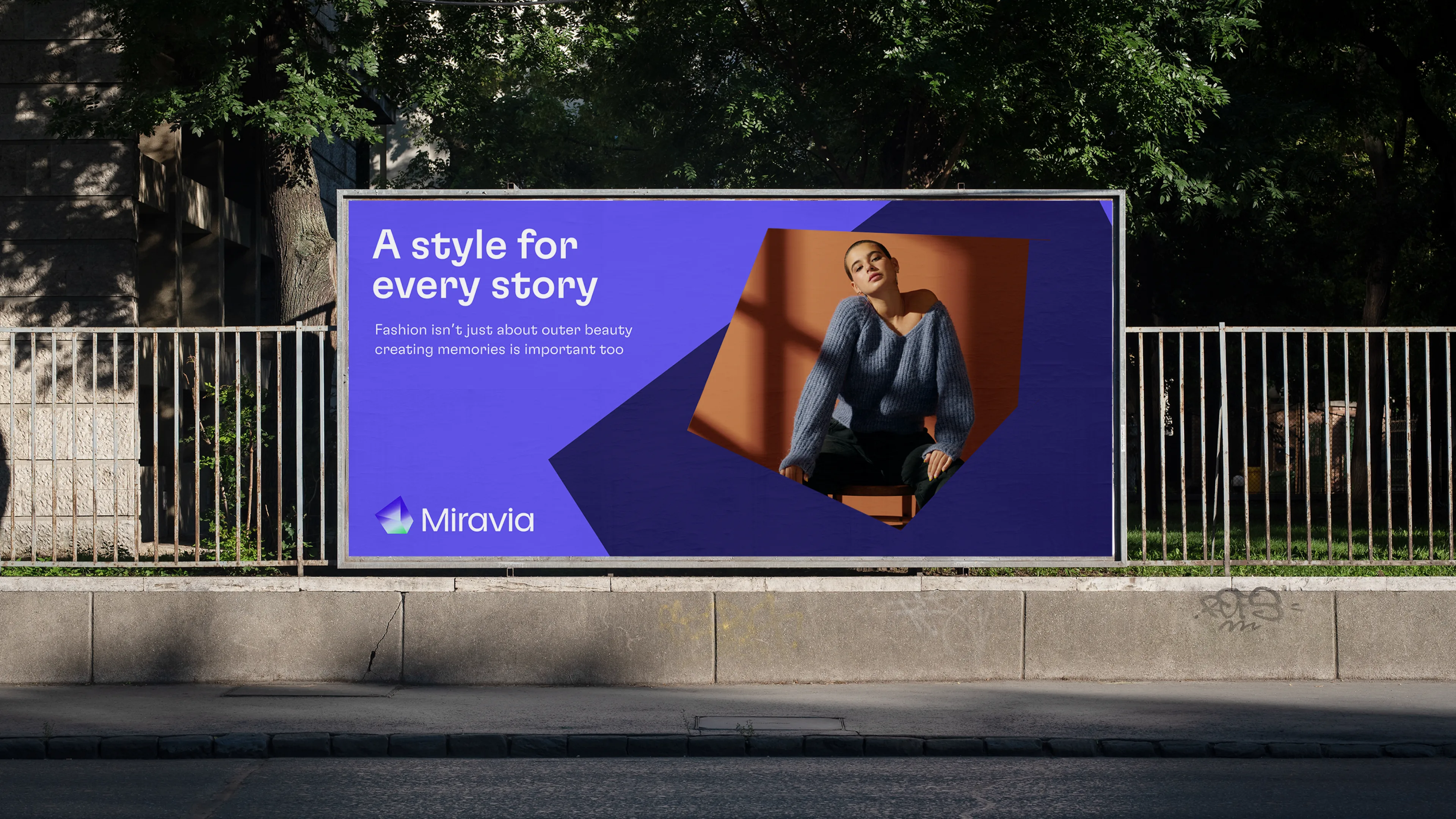
Billboard with a photo of a woman in a blue sweater, smiling and sitting, alongside the text: A style for every story. Fashion isnt just about outer beauty; creating memories is important too. Miravia.

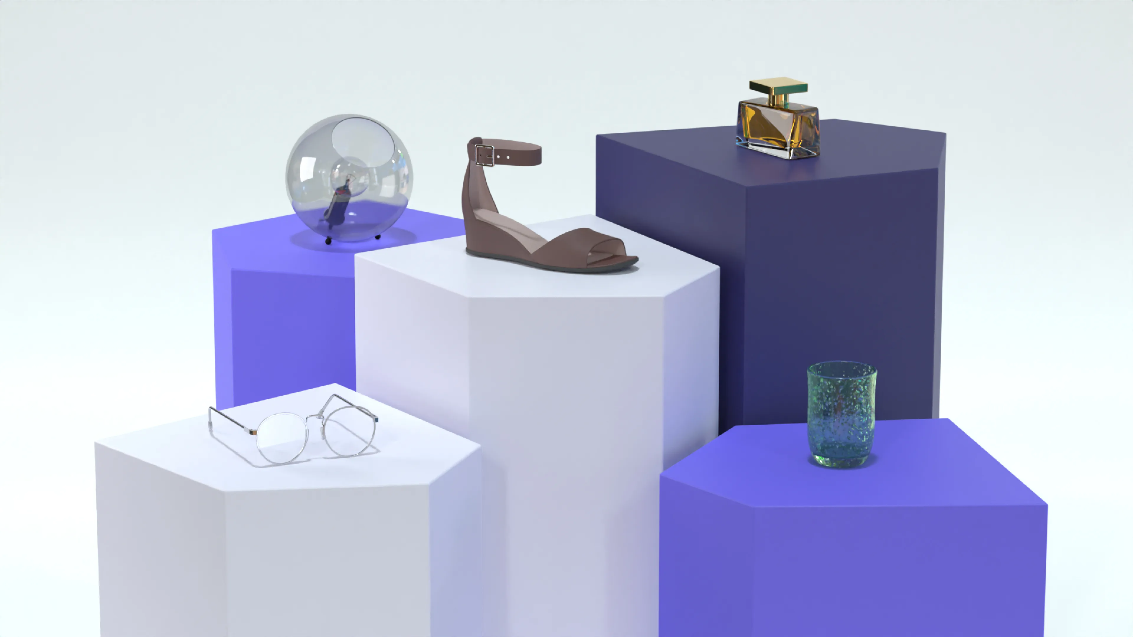
A brown sandal, eyeglasses, a glass orb, a glass tumbler, and a perfume bottle are displayed on geometric purple and white pedestals against a light background.
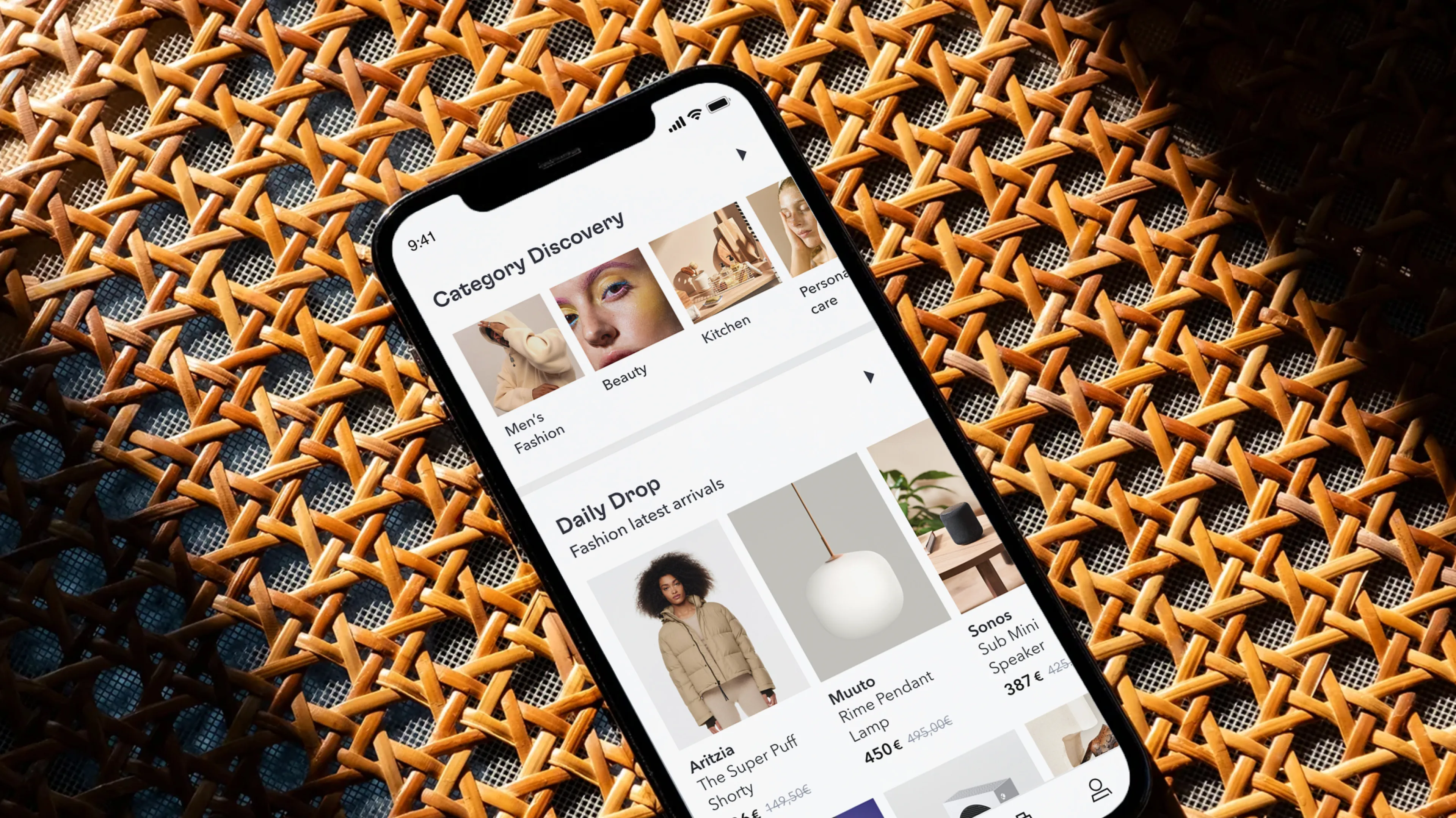
A smartphone displaying a shopping app screen, featuring categories like fashion, beauty, and kitchen, and showcasing daily drop deals, placed on a patterned wicker surface under natural light.
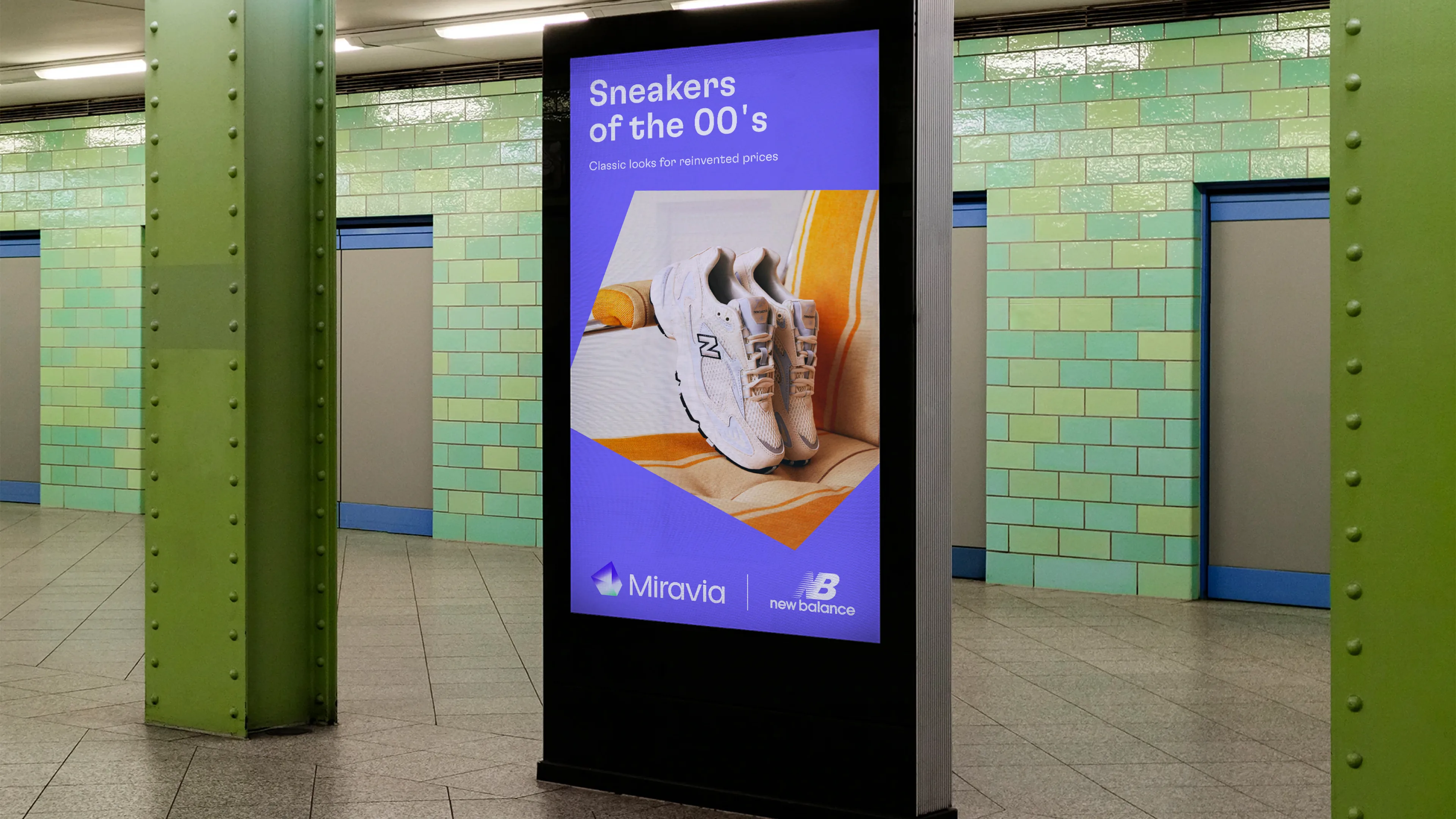
Digital advertisement in a subway station displays white New Balance sneakers, with the text “Sneakers of the 00’s, classic look for reinvented pros.” The background features green tiles and closed blue doors.
A purple and blue sign reading Pop-up Store with an arrow pointing left and the logo Miravia stands on a sidewalk against a stone building wall.

RelatedWork

Webex

The look of collaboration

webex-thumb-hero

MARV

Visual Identity

MARV Cover

Radio Television Luxembourg

United

rtl case study card v3

Atelier Cologne

Art from nature

Art from nature - Hero

What’s yournext frontier?

Footer Fallback Image Gradient
  • Privacy Policy
  • Cookie Policy
  • Perspectives
  • AKQA Companies
  • Sustainability
  • News